Sunday, August 28, 2011

CS5_ADDIE Research

After looking through a few sources to get a feel for the ADDIE concept, I have to say it seems like a very logical and beneficial set of guidelines.  One source stressed the importance of the Analysis and Design phases citing the old expression "measure twice, cut once."  I completely agree and believe proper planning is the key to an efficient and effective project.


I was happy to learn that the standards that my company practices very closely follow the ADDIE process. Whenever we begin a new course we always begin by creating a document called a Task and Skills Analysis to figure out the exact needs of student.  We also create a Training Development Plan where we strategize the best way to deliver the training.  These two documents would fall into the Analysis phase.  For the Design phase we always create a formal Course Design Guide to plan out content and how it traces back to objectives established in the Analysis phase.

I don't believe it's always necessary to create such rigidly standardized documents, but I do believe that an Instructional Designer must absolutely complete those phases in some manner before beginning any development.  The ADDIE process is cumulative and you must complete each phase consecutively to maximize the success of your training endeavor.

Included in my research were the following sites:

    BP9_RILS Links

    You can follow this link to view my comment on Emily's RILS video.


    You can also follow this link to view my comment on David's RILS.


    Saturday, August 27, 2011

    BP8_RILS Publication


    Brief Overview


    In this scenario, the instructor will introduce adult learners to uses of Diigo and get them interacting with each other’s shared research.

    1. Target Audience

    Adult learners.

    2. Materials

    Both instructor and learners must have a computer and access to the Internet.

    3. Objectives

    At the end of this scenario, the learner will be able to:
    • analyze the different ways they can use Diigo. 
    • utilize Diigo to bookmark and comment on the appropriate web sites. 
    • create a shared collection of websites and comments within a Diigo group.
    • reflect on the process.

    4. Procedure


    • Prepare instructions on how to use Diigo for your learners.
    • Create a Diigo group and invite your learners to join.
    • Create an assignment that will motivate your learners to bookmark and comment on particular websites (for example, I asked my learners to solve a mystery based on clues I created and certain websites I posted to the Diigo group).
    • Ask the learners to comment on each other’s contributions to the Diigo group.
    • Collect the learners’ reflection on the process.

    5. Web 2.0 Tool

    Diigo (http://www.diigo.com/) is a tool that allows you to bookmark, highlight, and comment upon websites and, in so doing, add them to your personal library.  Diigo also supports the creation of groups for sharing each other’s bookmarks and commenting on them.

    6. Social Participation/Social Learning

    The learners will be commenting on each other’s contributions within the Diigo group.

    7. Making Connections

    The learners will use previous online research skills to find appropriate websites and bookmark them.  The learners will discover how they can use Diigo to help them in their own environments.  Diigo will connect the learners with each other and with a global community of Diigo users.

    8. Create/Produce

    The learners will be creating a shared database of website links and providing feedback to each other.

    9.  Assessment

    In the scenario instructions I asked my learners to post a bookmark or topic to the group at least twice and to respond to another learner’s contribution at least once.  As the group administrator, I am able to monitor the Diigo group activity to ensure these requirements are met.

    10. Reflection

    The learners will email me their reflections on the scenario.  I will evaluate the entire process and the learner’s reflections and provide my own reflection in the RILS video. 


    Tuesday, August 23, 2011

    PE_9 Udutu

    As promised, I've begun using myUdutu to design my instructions for my RILS.  So far things seem easy enough, the tutorials do a good job of preparing you for creating your own course.

    I had mentioned I wanted my Diigo-based RILS to be motivated by a puzzle of some sorts.  Well I think I found the perfect puzzle.  A Carmen Sandiego style mystery that the learners must collaborate on Diigo to solve.  In other words, Carmen SanDIIGO!  Here I am creating the beginning of my course:

    When go to add the text, a separate editor opens allowing you the tools you might need:


    However... while I can admit there are merits to using myUdutu, I am person that is much too focused on creative design aesthetics to handle the limitations of designing within this tool.  I will be designing my instructions in PowerPoint first and then uploading them to myUdutu.  I love the fact that Udutu hosts your published course on their servers and provides easy access via a hyperlink.  So I will be using myUdutu's distribution features, just not its design features.

    PE_8 Udutu

    I love how myUdutu is an online platform!  You can set up accounts to have multiple authors working on or reviewing the same course.  What a fantastic feature!


    Another cool facet is how when you upload any media to your project, it automatically re-sizes and optimizes the media for bandwidth efficiency on the web.

    This tool also has the capability to recognize if a screen is 508 Compliant.  As a government contractor, this is something that I definitely need to worry about and I appreciate this feature.

    My overall analysis of this tool is that it is severely limited in terms of creative design, but at the same time expands the functionality of the course by offering so many pre-programmed interactions and features.  You may not have very much flexibility in editing these features, but at least they are there and easy to use. 

    PE_7 Udutu

    Gone through a bit of the tutorials, and I'm ready to do some analyzing.  So far no complaints.  They've got great onscreen navigation, a narrator, graphic animations, and (my favorite so far) a mouse-over simulation screen:


    As you run your mouse over the simulated myUdutu screen, different messages will pop up to explain the feature you are hovering over.  This is a fantastic feature and I bet it will be easy to implement.  As someone who creates mostly software training, screens like this can be invaluable.  Trying to do something like this within Captivate is clumsy, limited, and frustrating.  I'm interested to see how myUdutu tackles this feature.

    I've also discovered some other features including interactive screens, branching scenarios, and being able to import presentations from PowerPoint.  All of these features are key when designing good online training.  I also appreciate that myUdutu has a built in tracking feature that makes it very easy for both me to design completion requirements and the learner to track their progress.


    Monday, August 22, 2011

    PE_6 Udutu

    For my next set of practical experience blogs I'm going to be learning how to use myUdutu, an online course authoring tool.  I am learning  how to use this tool in preparation for my RILS.  I am going to deliver the instructions for my RILS to my students via a "course" built using myUdutu. 

    You can create a myUdutu account here: http://www.myudutu.com/myudutu/login.aspx

    Once you log in, you are greeted with a very user-friendly interface and many resources to help you get started:


    In the "getting started" box, you can see they offer a PDF guide called Getting Started, as well as two myUdutu built courses on how to use the tool and how to build effective courses.  I am going to go through these resources and see what I can learn! 

    Saturday, August 20, 2011

    PE5_Diigo

    For my RILS, I want to create a Diigo group for my learners so they will have a place to build a collective library and interact with each other's annotations.  During my research of Diigo, I tested this out by walking through the process of creating a group.  It was a relatively easy process to administrate a group.  I invited my friend to the group to help me test it out.  Here is a screenshot:


    Looks like everything works the way I hoped.  I posted a sticky note on a webpage and my friend was able to see it and add a comment of her own.  Those actions showed up on the news feed of our group.

    I feel like I have a good handle on the way my RILS is going to work.  I'm ready to start planning what exactly I'm going to have my learners researching.  Ideally I'd like it to be engaging and fun, like an online scavenger hunt, but we'll see...

    PE4_Diigo

    I am in the process of discovering Diigo.  I can't believe I never heard of this tool until I started this class.  Diigo seems like the online researcher's best friend.  It is especially useful for group collaboration.  Diigo's homepage provides a great video explaining its capabilities:


    Diigo V5: Collect and Highlight, Then Remember! from diigobuzz on Vimeo.

    My favorite feature is the interactive sticky notes that others can add to.  I also really like the screen capture feature.  I can see Diigo being incredibly useful for everyone.

    For my RILS I want to show my learners the benefits of using this tool by having them interact with its different features.

    Sunday, August 14, 2011

    BP7_OMM

    Hello world, my first iMovie project is complete!  I am just beaming with pride right now.  Hey iMovie, I don't need your movie-trailers-for-dummies template. This is how Kimber Moler does it:


    BP4_Aviary

    How have I not heard of Aviary before? This tool (or should I say suite of tools) is incredible.  It provides similar capabilities of the Adobe Creative Suite, but in a more user-friendly context, in a community sharing atmosphere, all online, and for free!  This is a resource that every designer should be able to make use of.

    Aviary has a tool for almost everything revolving around images and audio:


    This is great for someone like me who constantly needs to create visual content for my e-learning courses, but doesn't necessarily have the right tools loaded on their computer at work.  Now I am no longer limited to the licenses my company can afford.  I can create vector objects and put together music tracks all I want!

    When you click on an editor you get an overview of the program and are shown a video tutorial or demo:


    From here you can explore other users' creations or launch the editor.  Here I am playing around in the vector editor:


    If you look at the little window on the left you can see Aviary lists all the keyboard commands you can use with the selected tool.  This is a feature I wish Adobe had!

    The next picture shows me throwing some tracks together in the audio editor:


    I had an absolute blast piecing together different intros, loops, and ends.  This really is an amazing tool, I will be on the lookout for ways to implement it into my work.

    Overall this is a great tool because it is free, easily accessible, quite robust in its capabilities, and should be able to help anyone involved in visual or audio design.  The fact that it is also a community where users share with and inspire each other is icing on the cake.

    BP6_Link to Stephanie Waldner's Blog

    Follow this link to view my comment on Stephanie's Blog, "Designing my Educational Future," regarding her use of technology in her 2nd grade classroom.


    BP5_Link to Emily's Blog

    Follow this link to view the comment I made on Emily's blog, "21C ISD," regarding one of her RSS feed choices.


    Saturday, August 13, 2011

    PE3_iMovie

    Wow do I feel smarter right now.  Watching tutorial movies could be one of my favorite activities...

    I am very a much a "follow the directions" type of person so I tried to mimic Garrick as close as possible.  You can see in the photo below how I followed along with the projects and it was awesome!

     
    My favorite part by far was making the movie trailer.  Although they make it so easy it almost feels like cheating.  I used to spend so much time putting together fake movie trailers on my own, now I just feel like an idiot.  But I will have fun with this feature for sure and will probably try to incorporate it into everything I do.

    I also was blown away by the snap to the beat feature.  Creating slideshows set to music will never be the same!  I'm so happy iMovie has made this so incredibly easy.  I'm sure I will use this SO many times in the future.

    Since making the movie trailer was my favorite (and I'll definitely want to the chance to show it off), I'll post it here:


    And finally my fancy certificate to make it official:

    Looking forward to adding more certificates to my collection!

    PE2_iMovie

    Video editing is not new to me.  I've been working with video editors since I was little.  Very recently I took a class on Adobe Premiere.  That said, iMovie is completely changing the game for me.

    It's not that it has more or better capabilities than Premiere.  It's the way these capabilities are implemented. So far the program seems much more user-friendly and intuitive, yet just as effective.  Every nuance of the program strikes me as ingenious.  I especially applaud iMovie's use of color.  Color is a wonderful distinguishing indicator that, in my opinion, is not used nearly enough in most software.  Thank you iMovie for not being afraid to make things glaringly simple.

    iMovie's most radical difference from the traditional editor is its choice to display a movie in separate chunks of clips in a multiple row format instead of a single horizontal timeline.  I think this is an interesting and innovative move and I'm definitely willing to give it a shot.  However, I do appreciate that iMovie still gives you have the option of changing the display to work with a more traditional timeline:


    So far I have absolutely no complaints with this program and I can't wait to see what else is in store.

    PE1_iMovie

    So far my experience with Lynda's iMovie training has been phenomenal.  I'm just about to start the editing chapter, which means I haven't actually started working with iMovie yet, but even so I've been completely engaged.

    The instructional designer in me immediately started analyzing; what is it about this training that has me so easily captivated?  There are none of the flashy bells and whistles you might find in other online training: no arrows, no highlighting, no drawing on the screen, no crazy transitions or text animations.  Lynda's approach is simple and streamlined, just some video screen-capturing paired with narration and the occasional text overlay.


    My conclusion is that this approach works so well because it is the closest thing to mimicking real life.  It's as if a helpful friend is sitting next to me, walking me through the software.  Watching and listening to a demonstration is a much more natural way to learn than to click your way through slide after slide  of paragraphs and visuals.

    The lack of screen labels doesn't even bother me.  When I see software training delivered so effectively I realize that labels can be more of a crutch than a learning device.  The fact that there are no labels in Lynda's training actively engages me in trying remember what each button does as I see it in action.

    These are pretty big revelations for me as the majority of my work involves creating computer-based software training.  In the future I am definitely going to try to incorporate Lynda's concepts of natural learning into my own work.

    I also love how Lynda divides it's training into bite-sized video chunks.  It keeps me from feeling too overwhelmed.  Now I'm ready to go back for a second helping!

    Monday, August 8, 2011

    BP2_Fontstruct

    Confession:  I am a crazy person when it comes to fonts.

    A font can make or break a project.  A font tells a story.  A font sets the tone.  The tiniest nuances in font can drastically change the reader's interest in what you have to say.  In much the same way that we are able to tell the genre of a book by its cover, a font immediately conveys a message about its contents to the reader. Needless to say, in every text-inclusive endeavor I take on, I spare no expense in ensuring that my fonts inspire the proper motivation for my target audience.

    I remember one time I got into a heated argument with a colleague at work over her attempt to use the Arial font in a very dramatic promotional video that was underscored by Gladiator-esque music...  Am I the only person that is horrified by this???  We cannot let atrocities like this occur, people!

    OK, I might be slightly exaggerating, but the point is that I am very neurotic about fonts and I treat them as strategically placed mood adjusters when I create my training courses.

    Imagine my extreme excitement when I stumbled upon Web 2.0 tool Fontstruct.  Yes, this seems like the appropriate tool for me to start my reviews with.

    Let's begin!

    My exploration of Fontstruct was greeted with a fantastic flash video on the homepage that had me itching to create an account and get started.  You've got to go here and check it out: http://fontstruct.com/

    After a simple registration I was able to immediately start building.  It's an easy to use tool, a quick perusal of the help screen had me feeling comfortable in less than a minute.  Two minutes later I had designed my first letter:


    Quickly I am realizing how addicting this tool can be... and how much work can go into it.  You must be able to break the letter you envision down into squares and shapes inside of squares.  The possibilities and nuances are endless.  This is definitely a skill that could take a lifetime to master.  I can see myself really digging into this in future, but for now I'm satisfied with my A, B, C.


    Fontstruct allows you to save and download your font for your own use.  You can also share your "Fontstruction" with the community, view others Fonstructions, comment on them, and download those as well. There are over 16,000 so this is a wonderful resource.

    Fontstruct gets you thinking, gets you creating, and gets you sharing.  That's enough for my seal of approval.  Not to mention I am 100% sure I will be using it to create my own full alphabet, setting my own personal tone for many projects to come!

    Sunday, August 7, 2011

    CS1 RSS Feeds

    I used to always look at those little RSS symbols and imagine the day that I would be cool enough to actually use them.  And by cool I mean actively and purposefully organized.  Thank you ETC for forcing this issue because, honestly, I might have stayed lazy forever.  Now look at me go!


    I tried to pick feeds that would teach and inspire me in instructional design, e-learning, technology, and education as a whole.

    1) EMDTMS (http://www.fsoblogs.com/emdtms)
    This first one is a no brainer.  Following Full Sail's Education Media Design & Technology blog is sure to help me with this program and in my career.

    2) Free Technology for Teachers (http://www.freetech4teachers.com/)
    This seems like such a great site.  I feel like the posts here are going to teach me and inspire me.  Looking forward to it.

    3) The Education Technology Blog (http://educationtechnologyblog.com)
    Another interesting and robust blog on technology useful for education.  It's important to stay informed!

    4) Making Change, Ideas for lively e-learning (http://blog.cathy-moore.com/)
    This looks like an excellent blog for me.  It focuses on new ideas and resources for improving adult e-learning.  This is exactly what I need for my current job.

    5) Wired Top Stories (http://www.wired.com/)
    Wired magazine holds a special place in my heart.  The best research paper I ever wrote was inspired by an article I read in Wired.  Since then, I always like to periodically check their website.  It keeps me up to date on science and technology and provides a continuous source of inspiration.  Even though it is not directly related to my career I think it is so important to keep close those things that can ignite your creativity, passion, and motivation.  This site does that for me.  If science, technology, and entertainment are your bag, I whole-heartedly recommend it.

    Saturday, August 6, 2011

    BP3_iGoogle Screen Shots

    I created my iGoogle page over a year ago, but I am definitely realizing I was never using it to its full potential.  So glad that this class is already expanding my horizons.  And adding/organizing all those links strangely made me feel so much less stressed.  I love how technology has the ability to be not only useful, but sometimes surprisingly comforting.  I'm really beginning to understand the benefits of a PLE.

    Here is my Home tab (somehow I have managed to go through life without creating a Twitter account... looks like it's time to make one!):


    Here is my FSO tab (sans the CBR since I am a certificate student):


    And finally here is my ETC tab:


    I'm particularly grateful for that Google Docs gadget, I always thought it was a pain to access them the normal way.  What's your favorite gadget?

    Thursday, August 4, 2011

    BP1_Welcome to my blog

    Hello all!  My favorite thing in the world is to travel and explore so I thought why not treat this blog as a great adventure?  I'm looking forward to learning a lot throughout this educational journey, but even better is the opportunity to share my experiences in a creative and hopefully entertaining way.

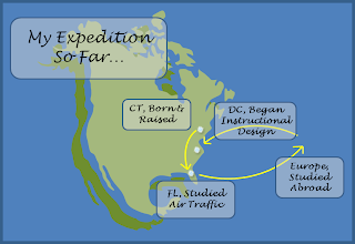
    But creativity wasn't always a part of my life.  In college I studied to be an air traffic controller.  It was a challenging program that taught me so many things, but it also made me realize I would rather spend my life problem solving, teaching, and entertaining; not controlling.  This realization led me down the path to becoming an instructional designer and I think it is the best possible career I could have fallen into.  The past few years have been an exhilarating series of trial and error as I try to do my best within a job I was never trained for.  Now here I am, starting this certificate program, and I cannot wait to bring everything I learn to my current job and beyond!


    While right now I deal mostly with adult e-learning, I do have a dream of becoming a classroom teacher one day.  I look forward to the support and experience that my peers can offer me and I hope to offer the same!